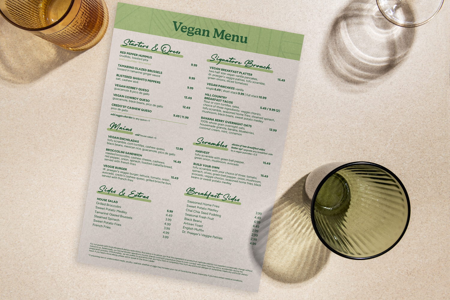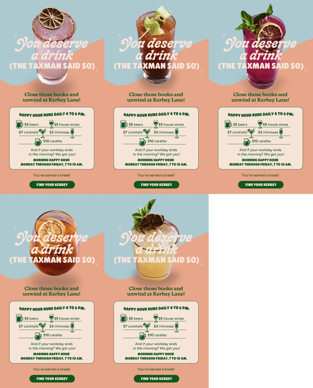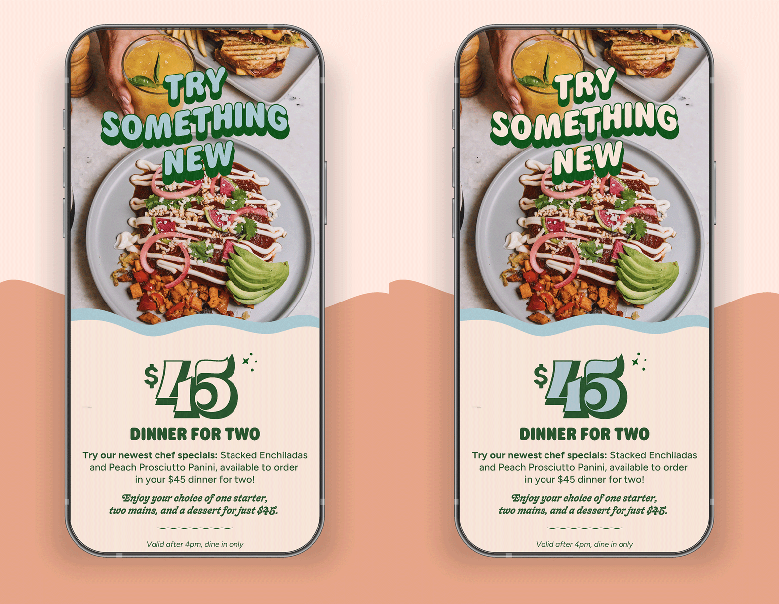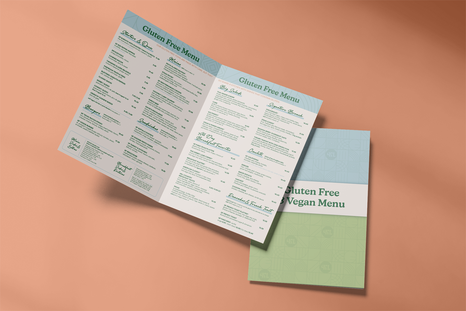
We’re known for being food and beverage graphic design experts, and it all started with Kerbey Lane Cafe. Over the years we designed and updated their menus, created print ads and generated info-graphics. Eventually, we got into package design. Kerbey Lane Cafe wanted to take their popular queso into grocery store aisles. And since standing with a pot and ladle in the chip aisle wouldn’t work, it was our job to create effective packaging. We got to be really good buds with the printer, showing up on a regular basis to ensure a flawless final product. It ended up being a hit, and we went on to create a package design for Kerbey Lane Pancake Mix as well.

Queso Packaging

How do you get Kerbey Queso off the shelves of Whole Foods and into the homes of eager Austinites? In 2016 We developed the high-quality, on-brand packaging that took Kerbey Lane Cafe beyond the restaurant and into the grocery store. Just like the queso, my process was made from scratch and turned out just right!

Four years ago Kerbey Lane Cafe, your source for home-grown comfort eating, decided to let us eat their queso at our homes instead of just in the restaurant. Since it would be impractical to hand-deliver a ladle of queso to every home, it was my job as Creative Director to develop packaging that would take the product into grocery stores.

While this project wasn’t my first work with packaging, it definitely took me to a new level of complexity. This wasn’t just marketing and branding - it was all that on the curve of a queso container.

Play with it. Having started with just a container and no template, our first move was to start prototyping with my scissors and sticker paper. Creatives tend to learn quickest by doing and seeing what we’re working with before googling templates gave me a stronger sense of how to get what We wanted, not what was easy to duplicate.

Collaborate. No one at KLC had done this before, but guess who had: the printers! Rather than trying to prove that We could do it alone, We opened ourselves up to learning from the most experienced folks in the room. The printers became my partners, adding their expertise to my creative vision.

Get it the F*CK right. Making the perfect package was more than just a creative endeavor. Yes, We made multiple design concepts to capture the exact branding we wanted, but then We had to make sure it looked right on the product. My printer buddies got to know me really well when We kept showing up to make the adjustments to my design when the test prints didn’t line up perfectly. Ultimately KLC got what they wanted: delicious queso in the homes of Whole Foods shoppers across Austin. And we got a product we were proud to see on the shelves. And eat in pajamas...

THE COLORWORKS DIFFERENCE

While this was outside of my day-to-day work at the time, We approached it as we would any other: plan a process that ensures you get it right. It was frustrating when the first attempt didn’t go to plan, but relying on a process that ensures excellence meant We had the time and space to get it the f*ck right. 

Making it work for you: Wherever you are in your packaging process, ColorWorks will get you off the page and onto the shelves. Starting with sticker paper or your existing template, we will help you develop your vision, work with printers and get you exactly what you need to launch a product that makes you proud!

No items found.
No items found.
No items found.
LET’S KEEP
IN TOUCH!

Sign up for our
blog post and updates sent directly to your email!